 |
| Album cover |
 |
| Advert |
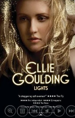
This album is called 'light's' and the title has an luminous effect, which is a direct component of the title.
She is represented in a very casual and cool way as she is positioned looking down with her arm above her head. She doesn't have that much make up on whereas other pop/indie artists usually do, which creates a very laid back view of her. This could suggest that her music is more important than her appearance. Her hair is styled quite naturally which matches her make up reinforcing the importance of her music rather than her image. She is wearing a black top which is quite bland and it makes her look natural and plain as an artist, but due to this she appears to be unique as most pop artists dress glamourously and over the top. The camera shot is a close up of her as the main focus and her name is written as the masthead in a retro style font which stands out, underneath is the title of the album written in the same font. The fonts are very bright which reflects the title of the album. The colour scheme for this poster is quite natural with blacks, whites and vibrant yellows. The vibrant yellow text connotates the title of the album which is 'lights' due to them being yellow and bright. The masthead also stands out more due to its brightness. The artwork used in her hair also brings 'light' to the poster and reflects the connotations, it also attracts more attention to the artist as it adds more sophistication and glamour to the poster. Underneath the title of the album there are 3 positive reviews from websites and magazines which will help promote her album. Also at the bottom of the poster there is the institution (record label) and copyright information.
No comments:
Post a Comment